The Problem
Most color palette generators prioritize aesthetics over usability. Designers often create beautiful palettes only to find out during development that they fail WCAG accessibility standards, leading to costly redesigns or exclusionary products.
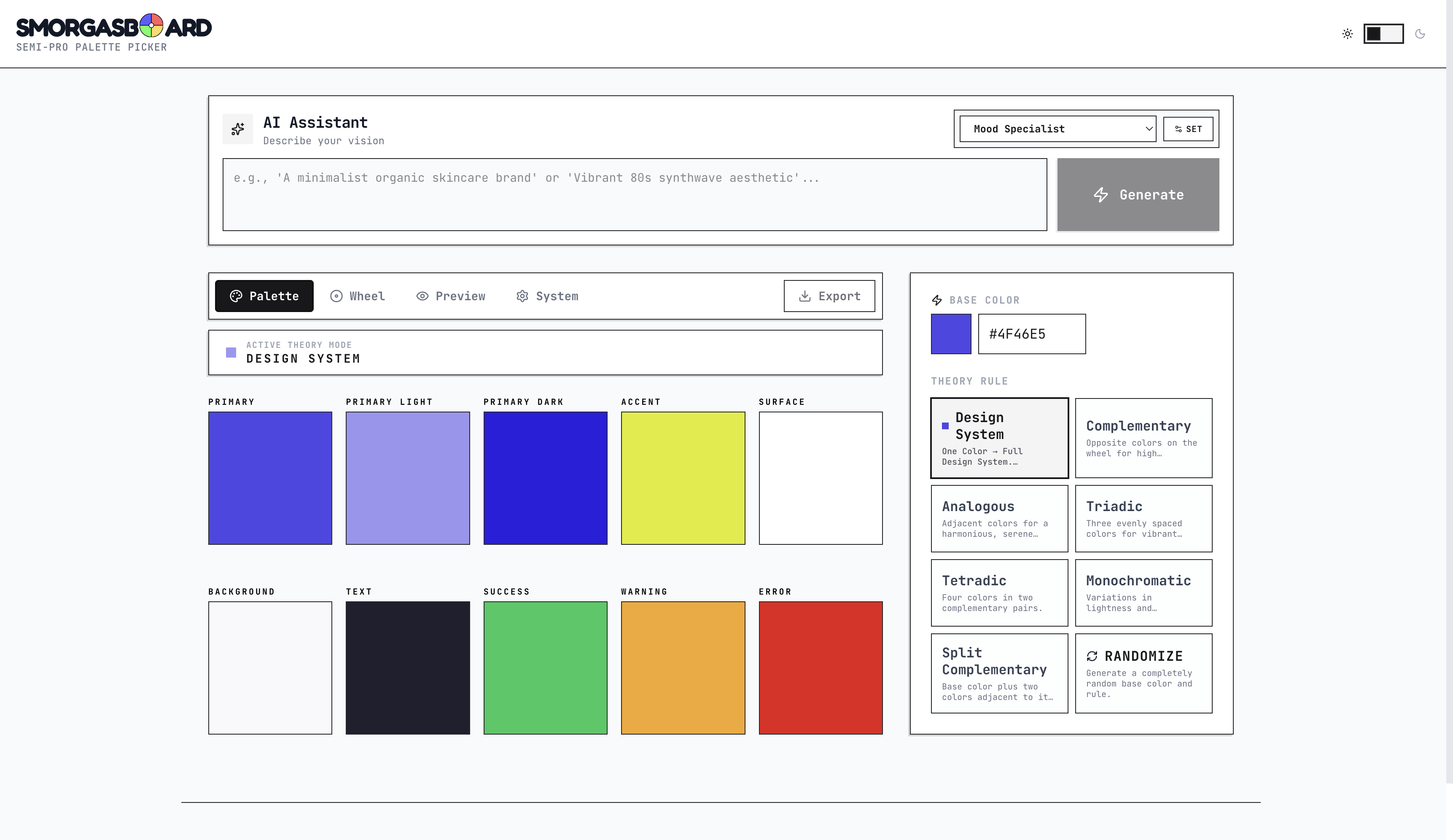
The Solution
Smorgasboard is an AI-augmented color orchestration tool that bridges the gap between creative intuition and technical compliance. It doesn't just generate colors, it builds accessible design systems.
Initial Design Approach
How might we bridge the gap between aesthetics and empathy by designing for the edges, creating a real-time toolkit that helps designers see through a wider lens and build for the full spectrum of human experience, everywhere?
.png)
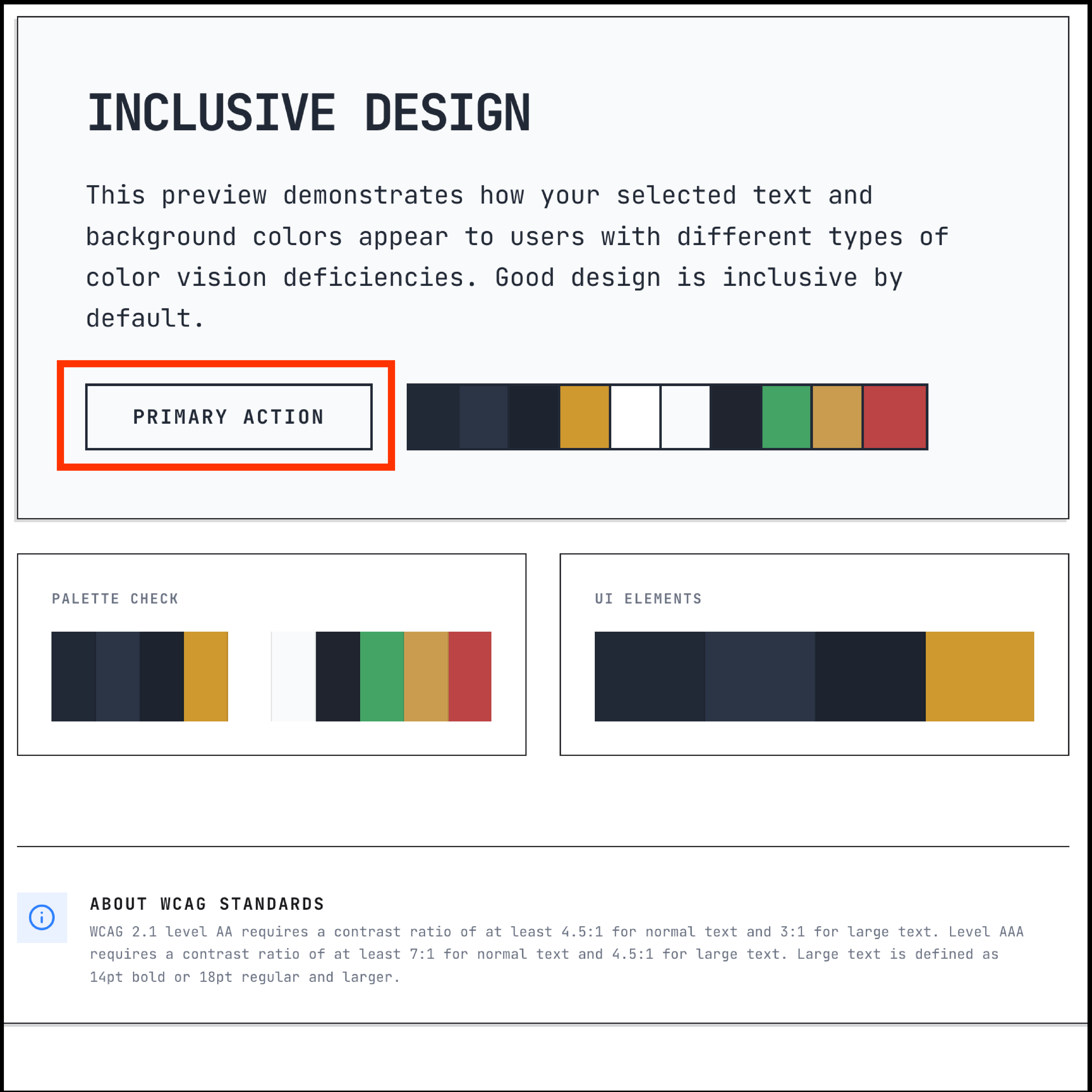
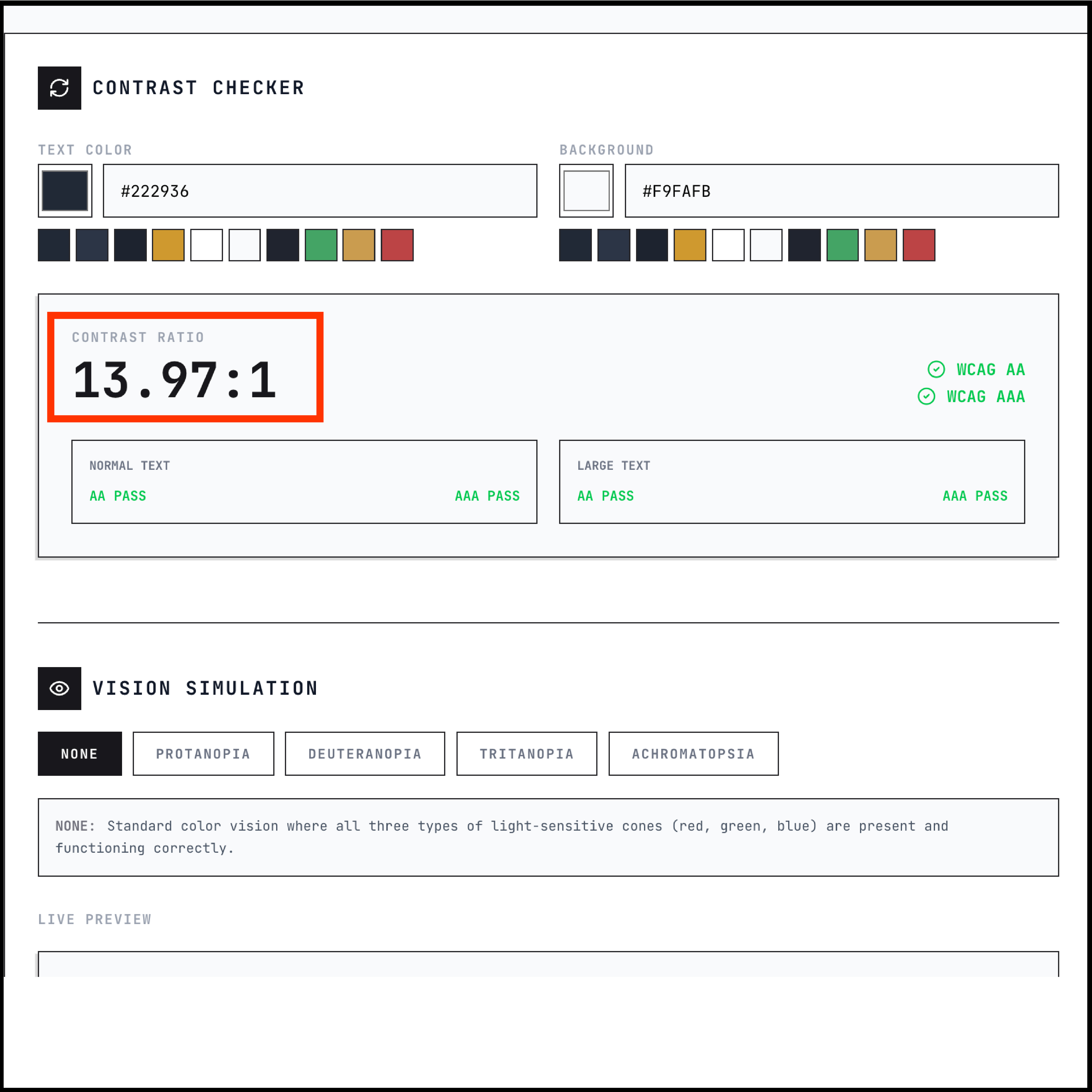
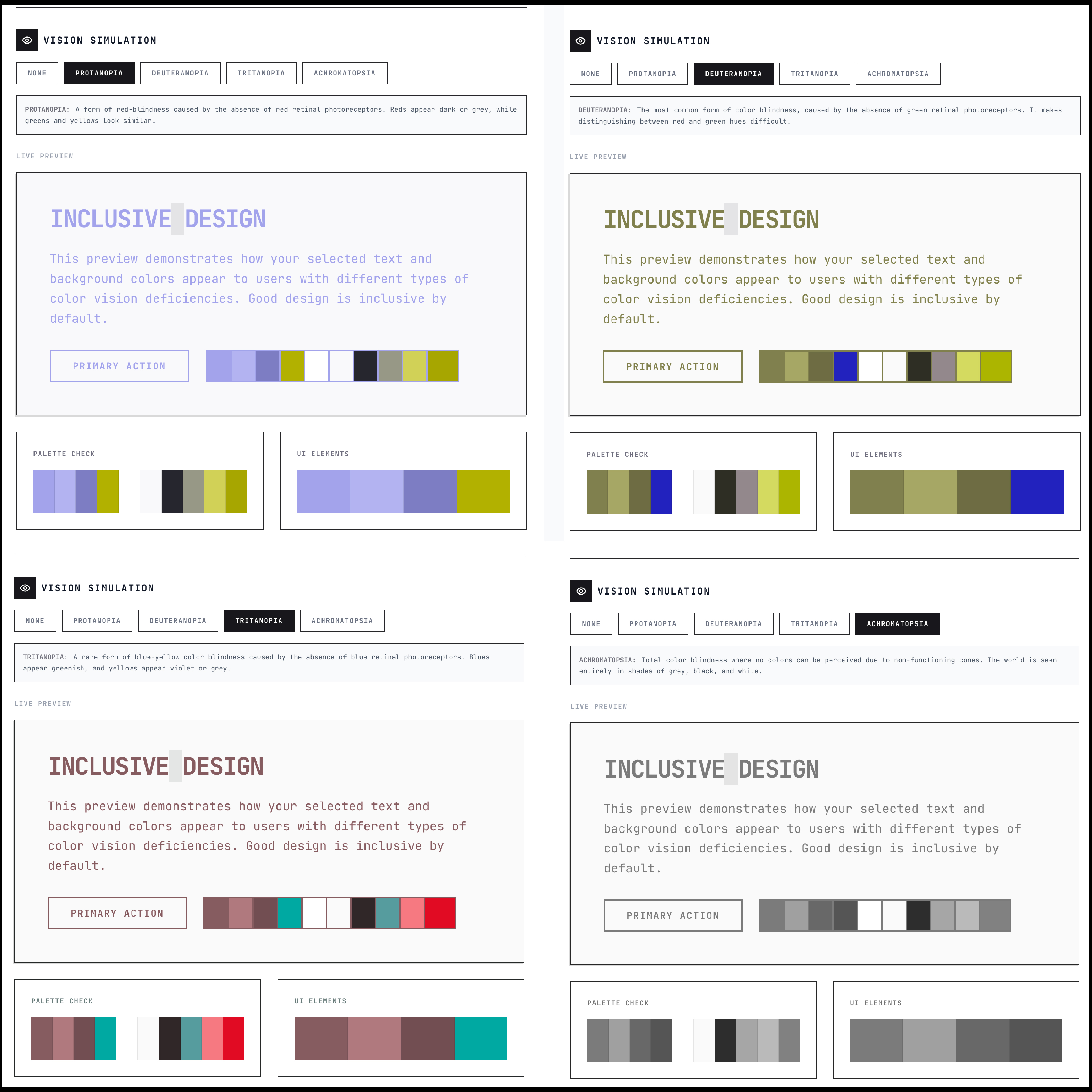
Inclusive design isn't a checkbox, it's a commitment to human-centered experiences. I built this system to bridge the gap between aesthetics and accessibility, featuring real-time contrast validation, color-blindness simulations, and adaptive themes. It’s about ensuring that every palette I design is as functional as it is beautiful—for everyone, everywhere.